




Ruta Del Berry
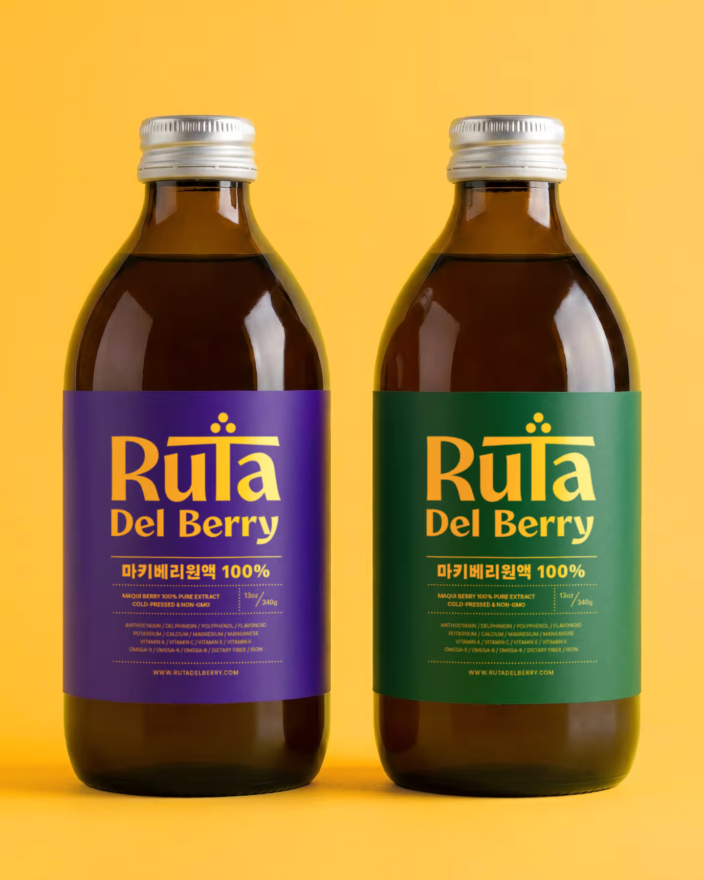
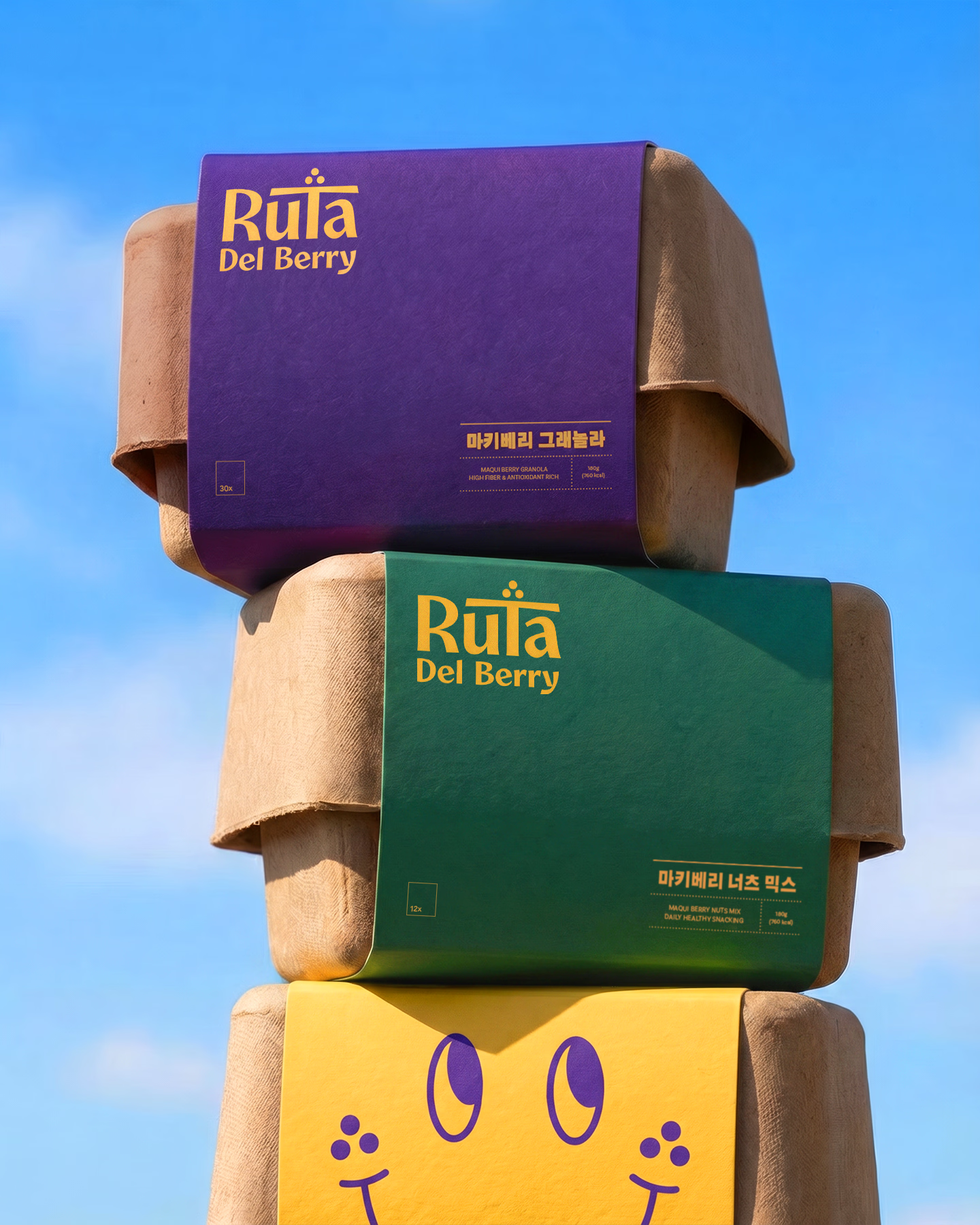
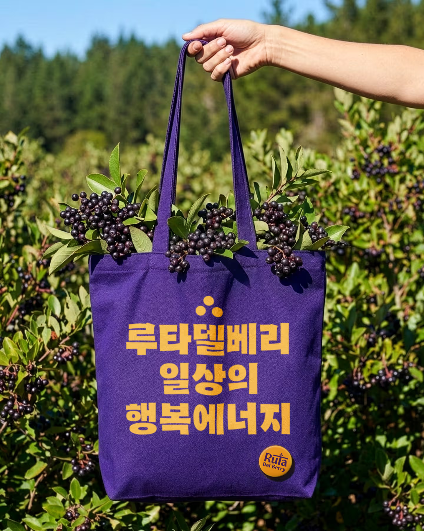
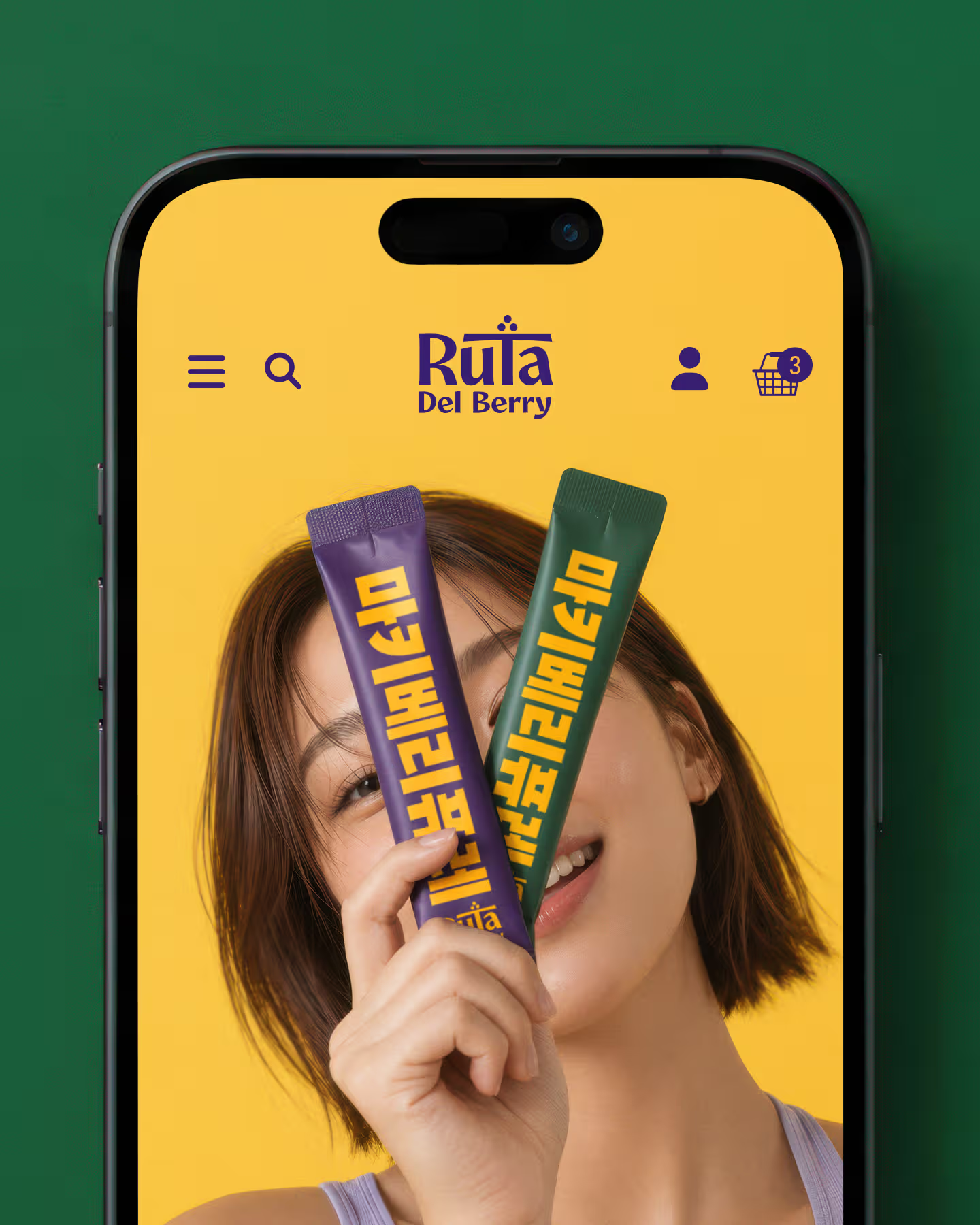
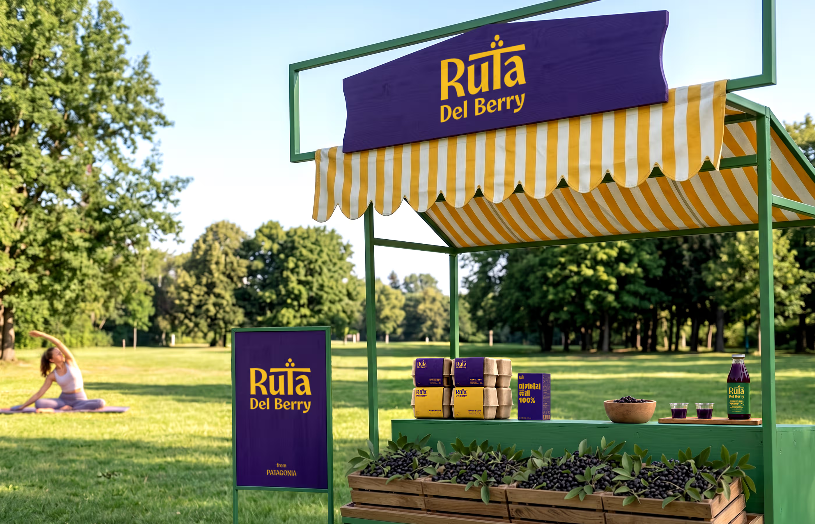
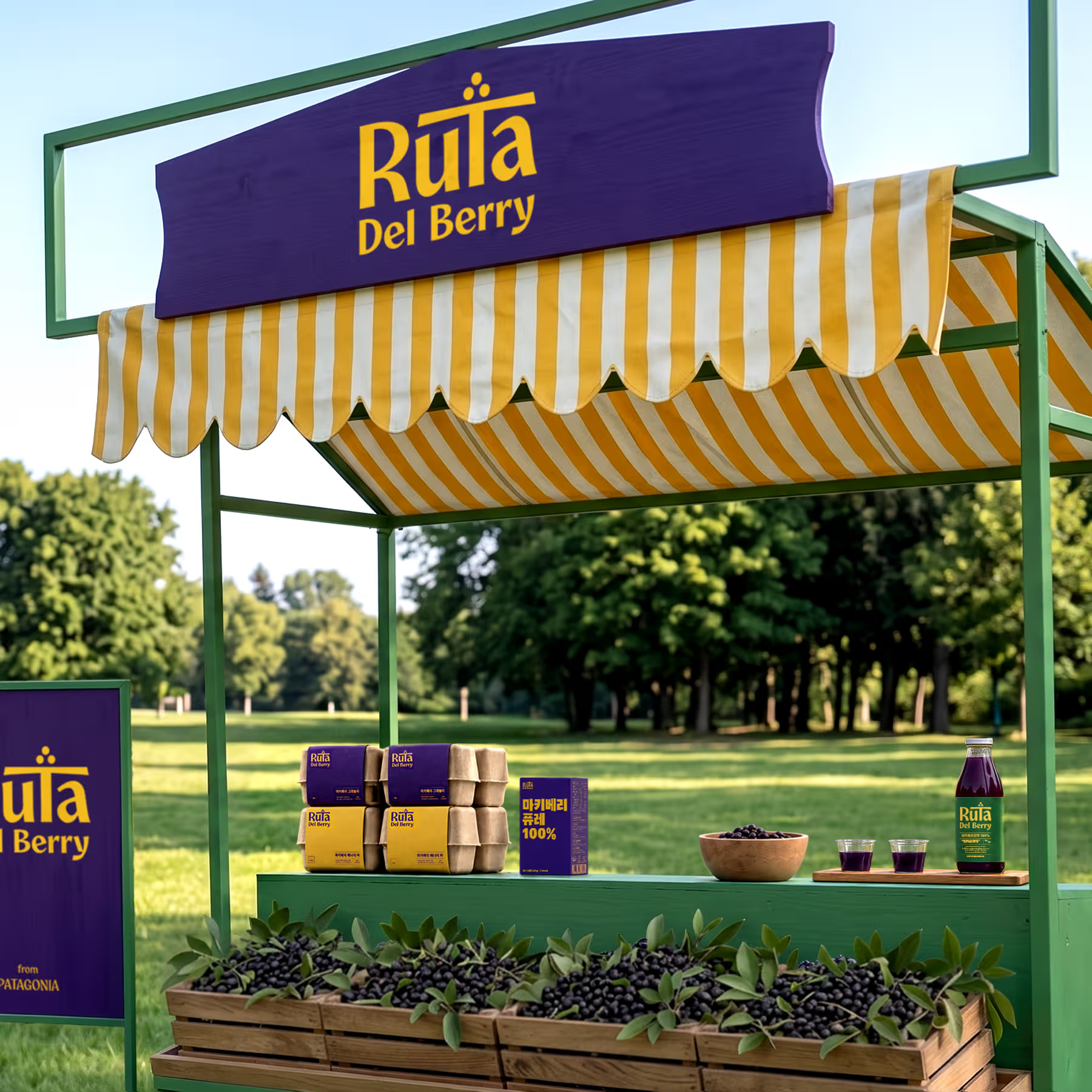
파타고니아의 청정 자연에서 채취한 마키베리 음료, 루타 델 베리의 브랜딩 디자인 작업입니다. 로고는 이국적이면서도 유희적인 활력을 느낄 수 있도록 기획되었습니다. 영문 철자 'T'를 마키베리를 담아내는 둥근 접시의 형태로 형상화하고, 그 위에 안착된 세 개의 점으로 신선한 베리 열매를 위트 있게 표현했습니다. 남미 특유의 정열적이고 힘찬 에너지는 생동감 넘치는 세 가지 핵심 컬러 팔레트를 전면에 내세워 시각적으로 전달했습니다. 패키지 전반에 적용된 한글 타이포그래피 역시 큰 사이즈와 힘 있는 획으로 과감하게 배치하여, 제품 본연의 건강하고 역동적인 생명력을 직관적으로 보여줍니다.
This is the branding design project for Ruta Del Berry, a maqui berry beverage harvested from the pristine nature of Patagonia. The logo was designed to exude an exotic yet playful vitality. We visualized the English letter 'T' as a round plate holding the maqui berries, and playfully represented the fresh berries with three dots resting upon it. The passionate and energetic vibe unique to South America was visually conveyed by prominently featuring a vibrant three-color palette. Furthermore, the Hangul typography applied throughout the packaging is boldly arranged with large sizes and powerful strokes, intuitively showcasing the product's inherent healthy and dynamic vitality.


