

NIKE Pegasus 42
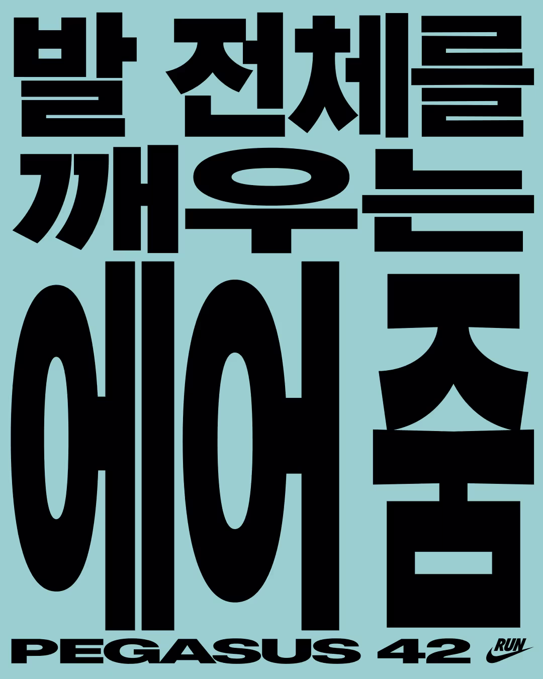
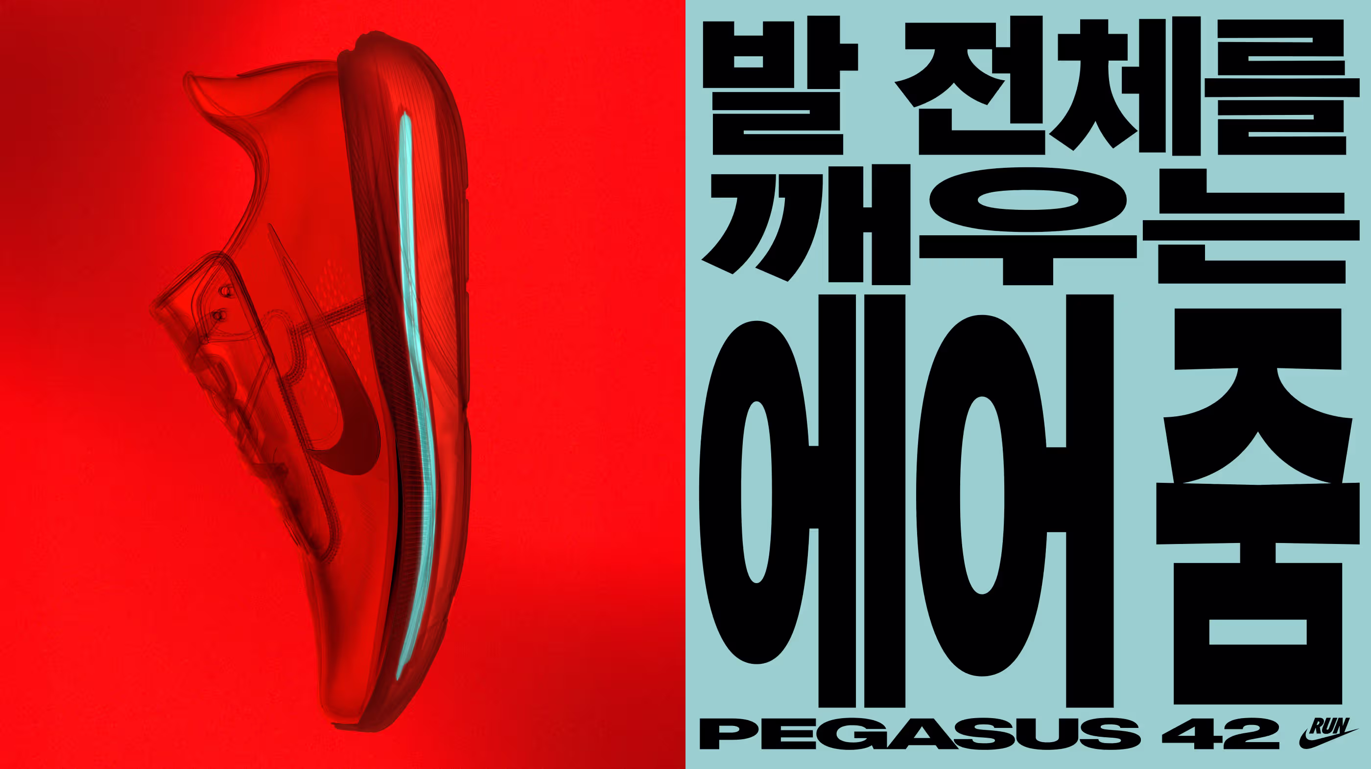
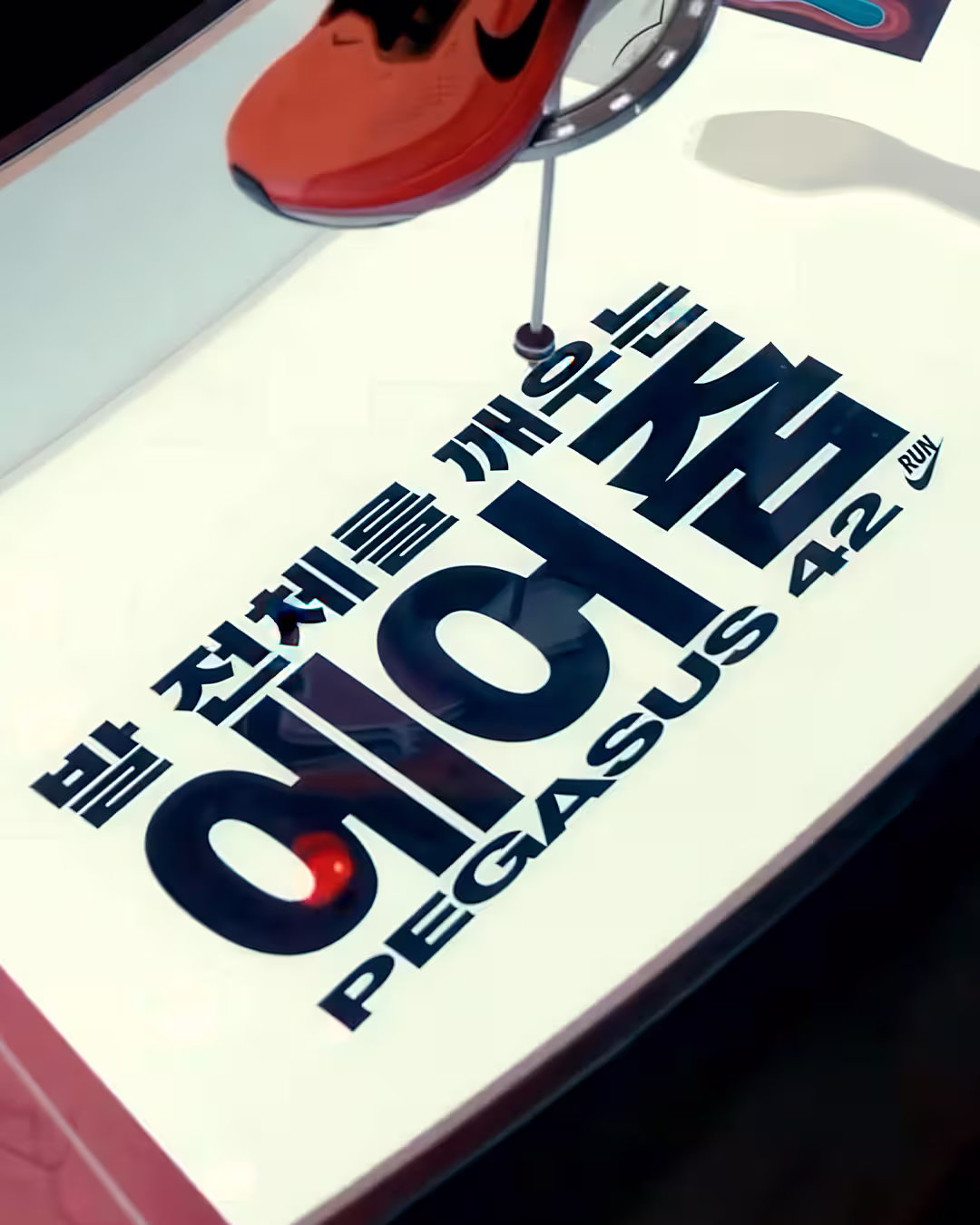
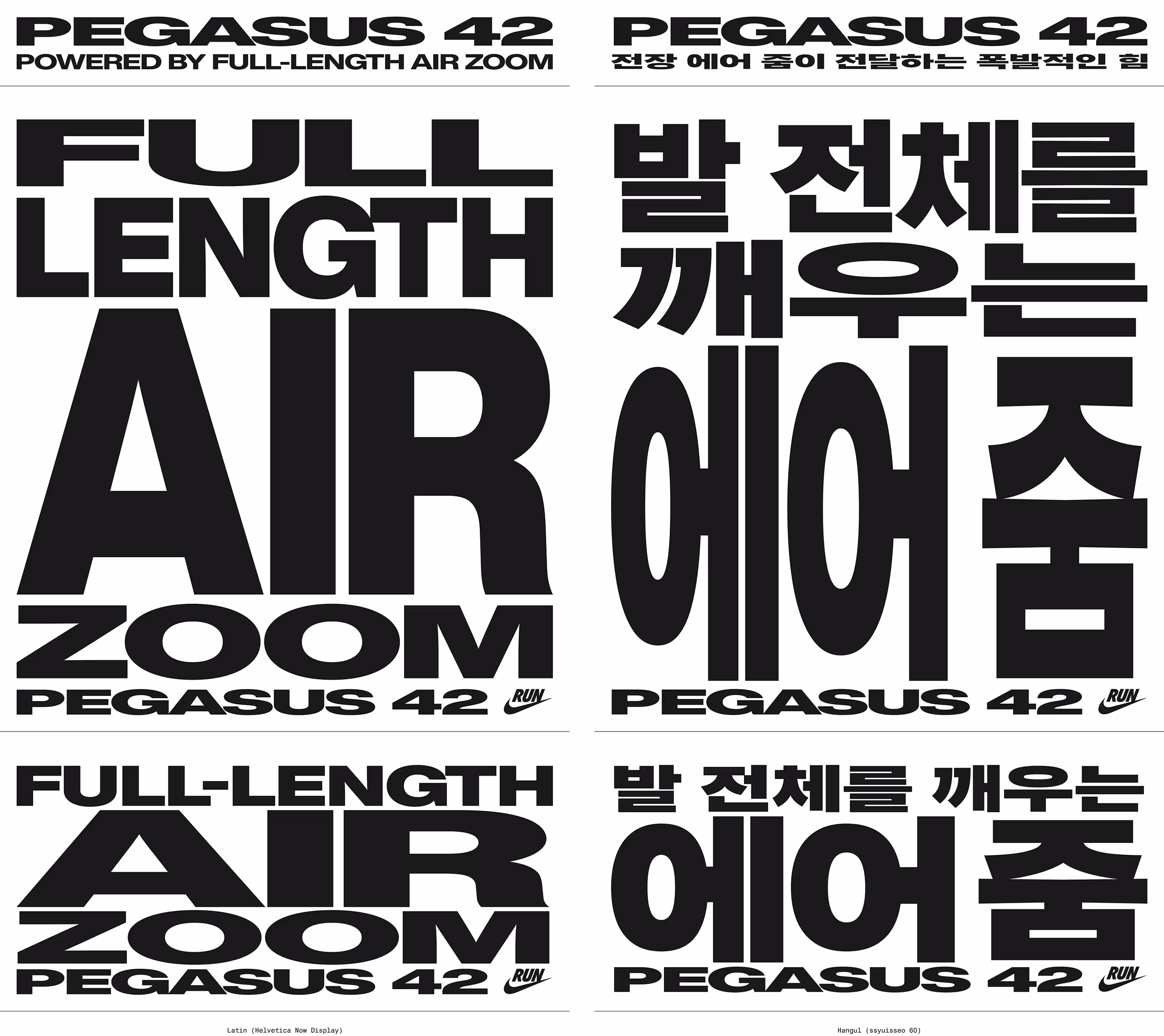
나이키 페가서스 42 에어줌 캠페인의 메인 카피 국문화 작업입니다. 오리지널 영문 캠페인은 Helvetica Now Display 서체를 활용해 글자 폭에 극적인 대비를 주고 자간을 좁혀 러닝화 특유의 폭발적인 에너지를 시각화했습니다. 이 과감한 분위기를 한글로 온전히 이식하기 위해, 뼈대가 굵고 속공간이 꽉 차 단단한 밀도감을 주는 슈이써60 서체를 채택했습니다. 영문 원본의 극단적인 장평 변주를 한글 구조 안에서 획을 다듬고 조율하여 역동적인 속도감을 완성했습니다
This project involved the Korean localization of the main copy for the Nike Pegasus 42 Air Zoom campaign. The original English campaign utilized the Helvetica Now Display typeface, creating a dramatic contrast in letter width and tight tracking to visualize the explosive energy and speed unique to the running shoe. To seamlessly translate this bold vibe into Korean, we selected the Ssuiisseo 60 typeface as a base for its thick skeleton and full inner spaces. Furthermore, rather than using the font as is, we extensively refined and customized each character to implement the extreme width variations of the original text within the Hangul structure, meticulously perfecting a Korean lettering that captures a dynamic sense of speed.


