




NIKE NSW Studio Fleece
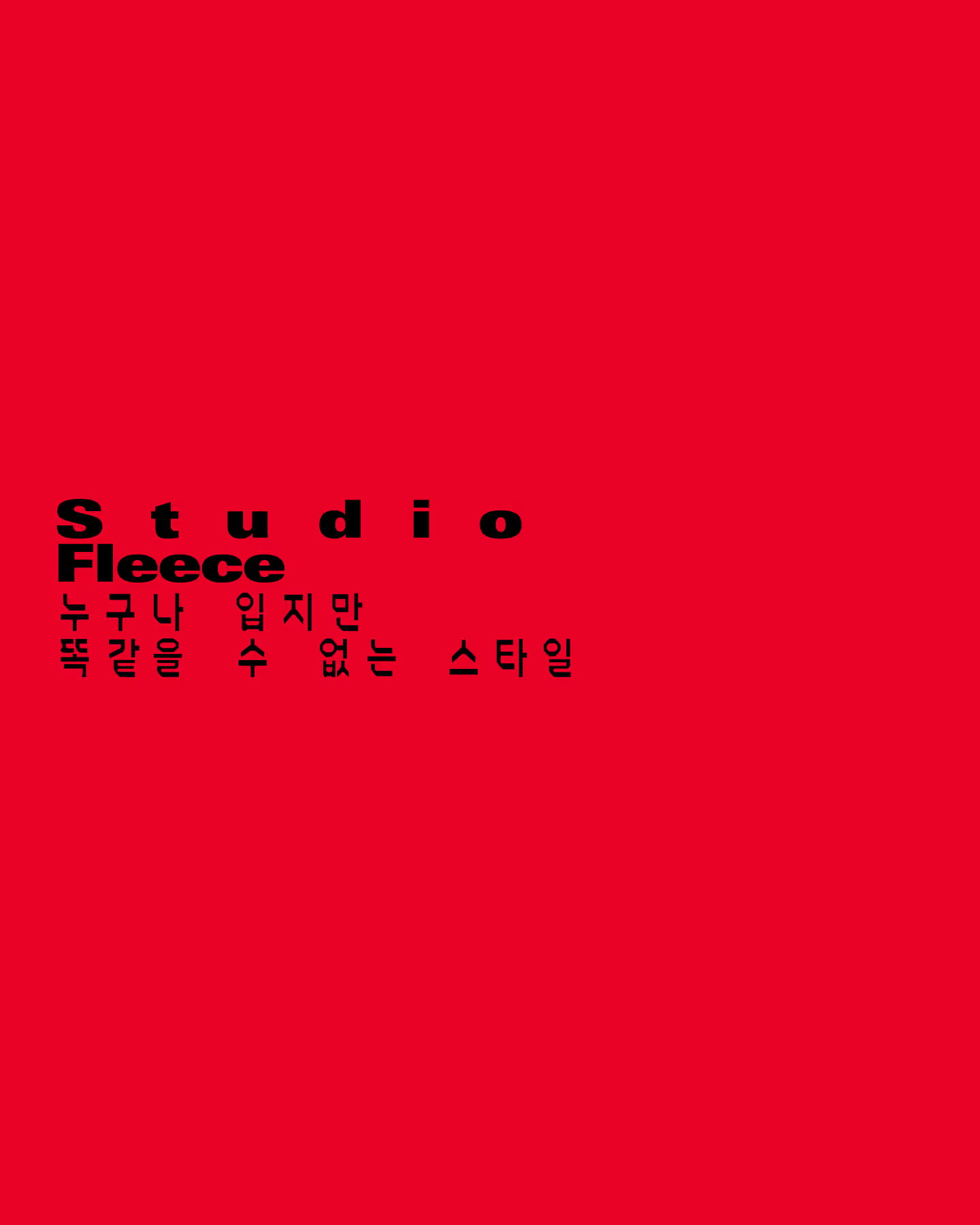
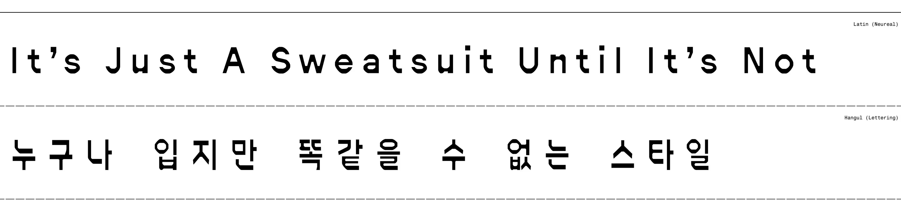
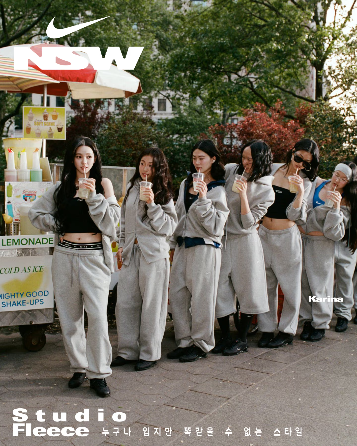
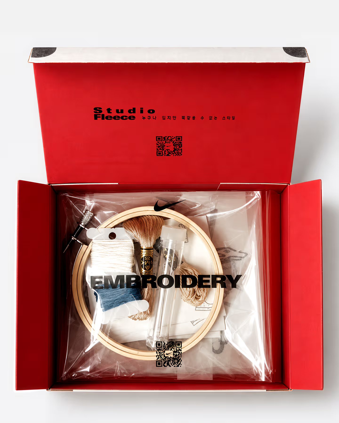
나이키 스튜디오 플리스 캠페인의 타이포그래피 국문화 작업입니다. 오리지널 영문에 사용된 Neureal은 디지털 오류와 왜곡에서 비롯된 불규칙한 곡선, 반전된 획 대비가 특징인 실험적 산세리프 서체입니다. 이러한 조형적 특징을 한글에 반영하기 위해 자소의 좌우대칭과 경직된 기하학적 구조를 의도적으로 강조하고, 획의 강약과 곡선의 형태를 재해석했습니다. 자모의 비례와 자간을 세밀하게 조율하여 원본 특유의 인공적이고 낯선 인상을 유지하면서도 한글의 가독성과 시각적 균형을 확보했습니다.
This project involved adapting the typography for Nike’s Studio Fleece campaign into Korean. The original Latin typeface, Neureal, is an experimental sans-serif characterized by reversed stroke contrast and irregular curves derived from digital glitches and distortions. To translate these distinctive qualities into Hangul, we deliberately emphasized bilateral symmetry and rigid geometric structures in the letterforms, while reinterpreting stroke contrast and curvature. The proportions and spacing of each character were carefully refined to preserve the original typeface’s artificial and unconventional aesthetic while ensuring legibility and visual balance in Korean.


