

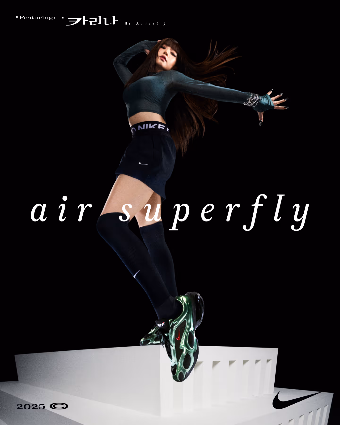
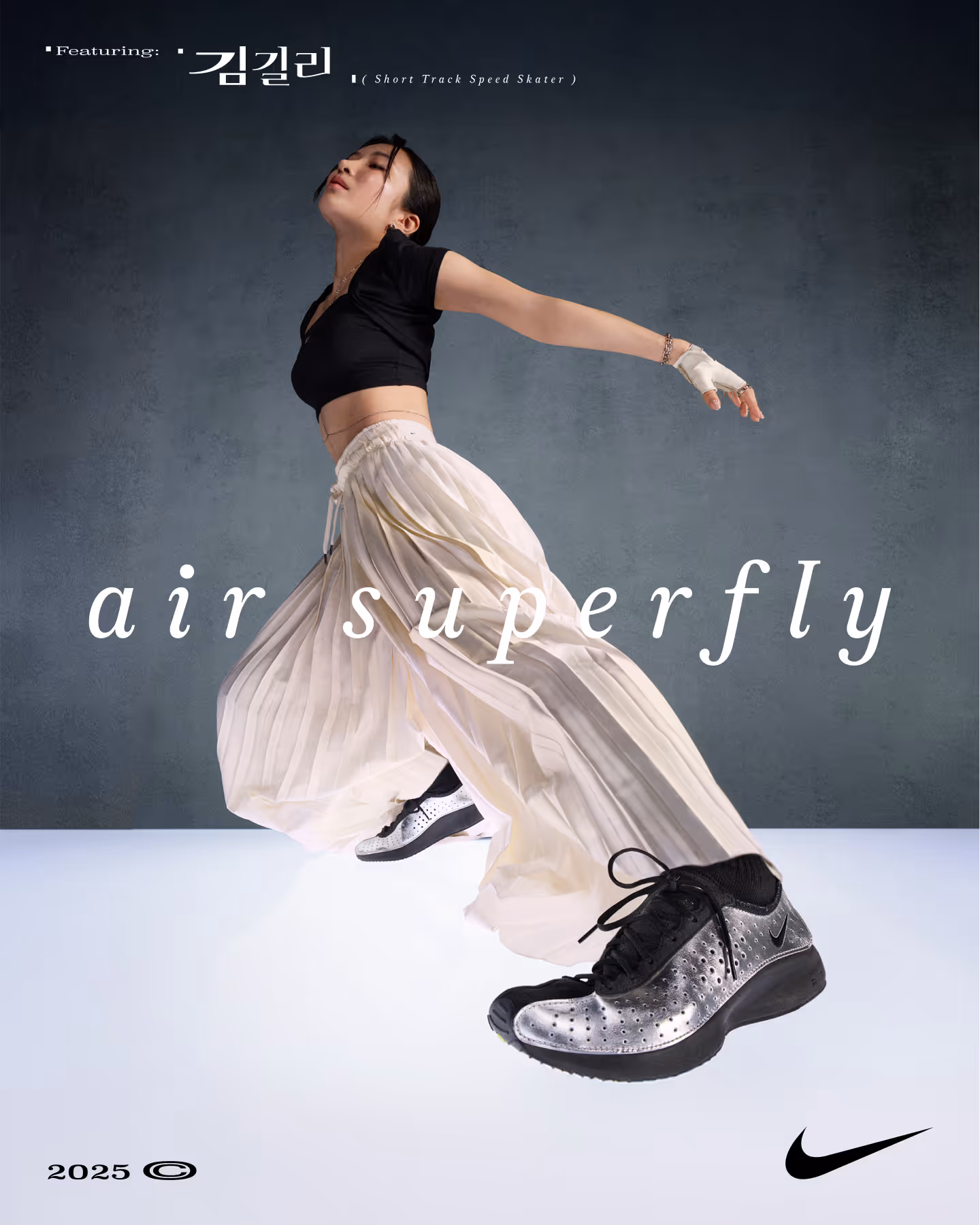
NIKE Front Runners
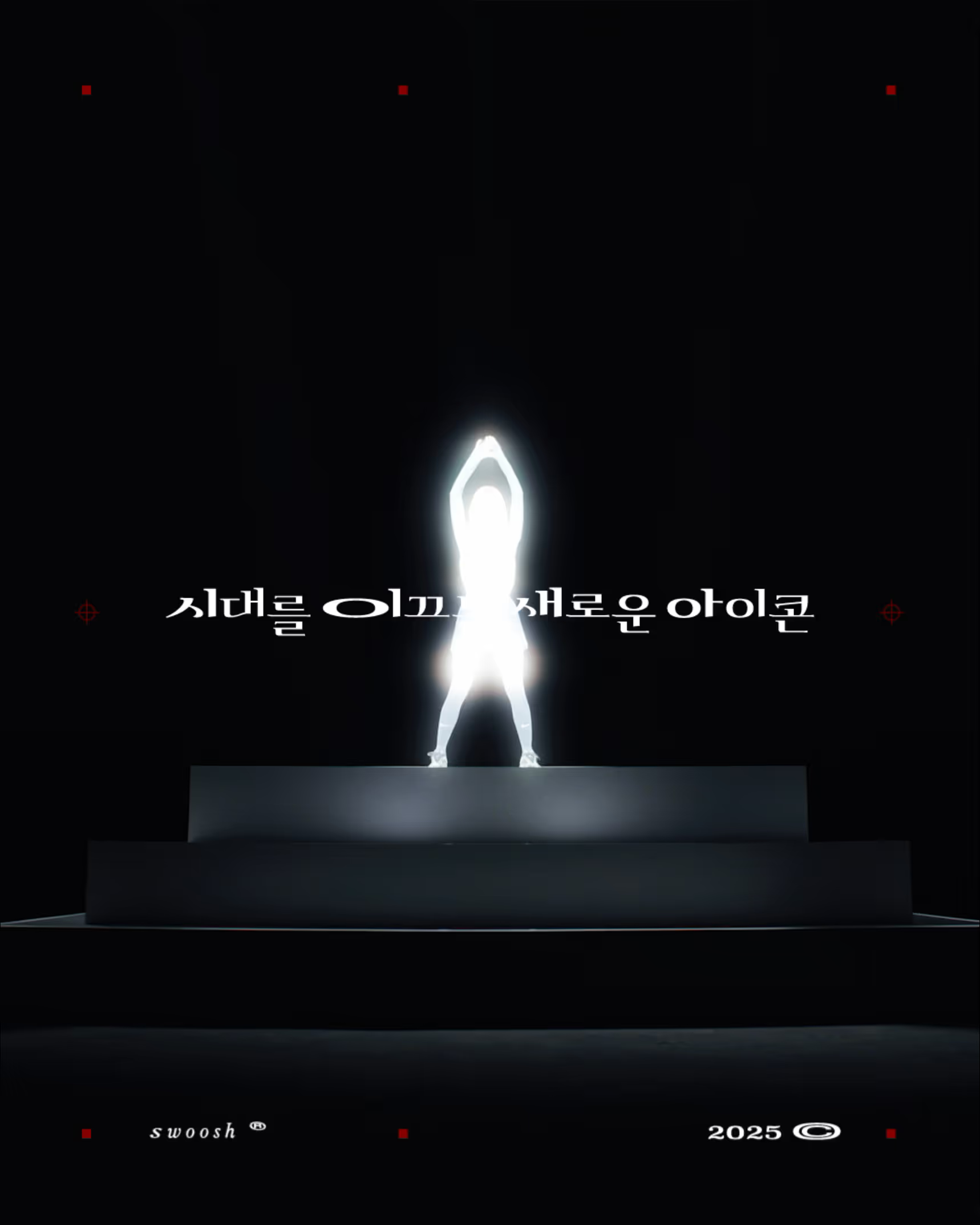
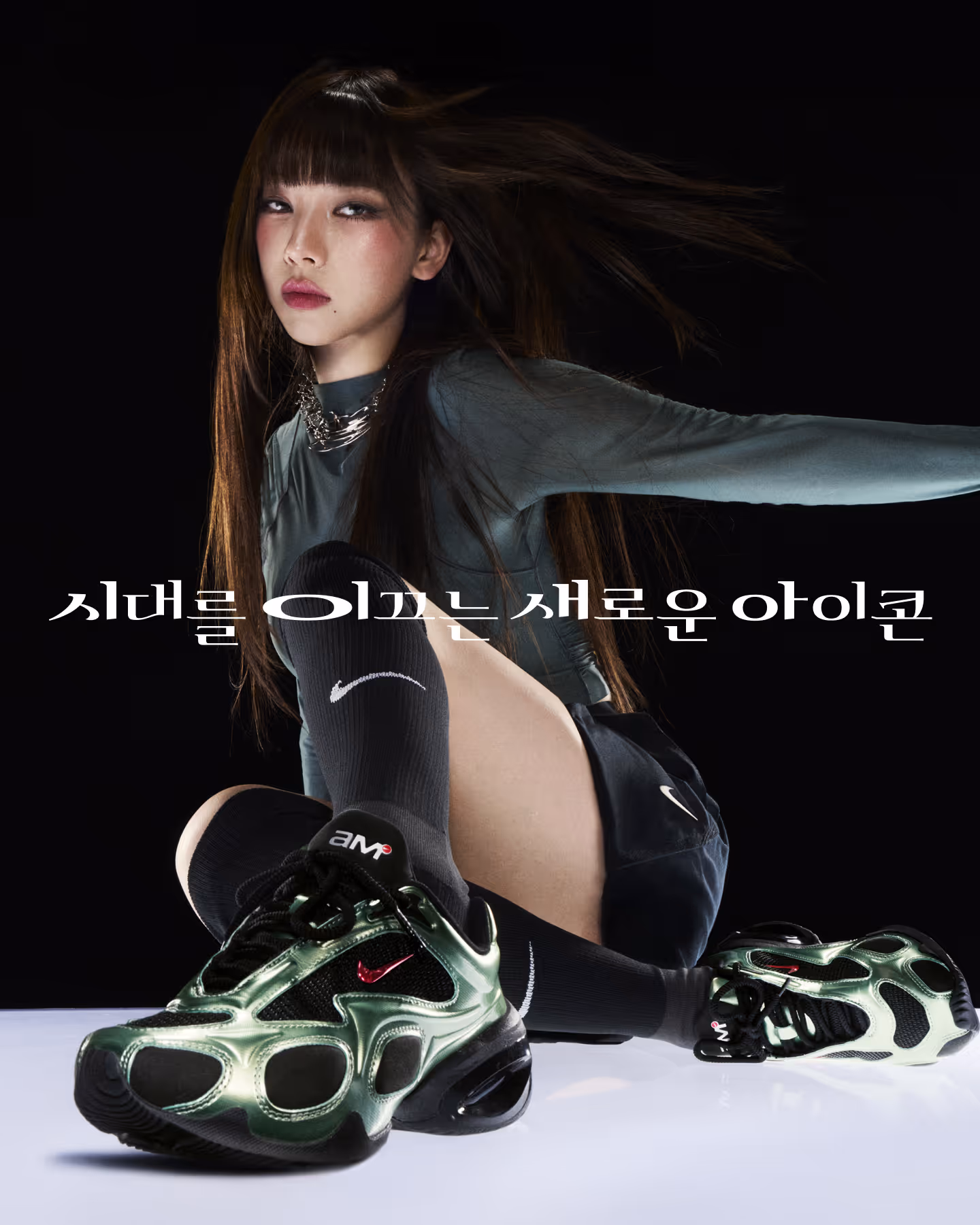
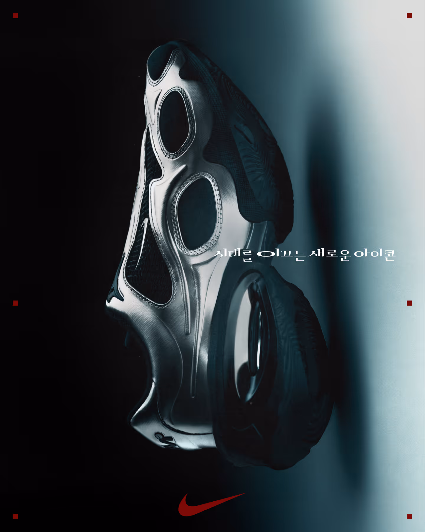
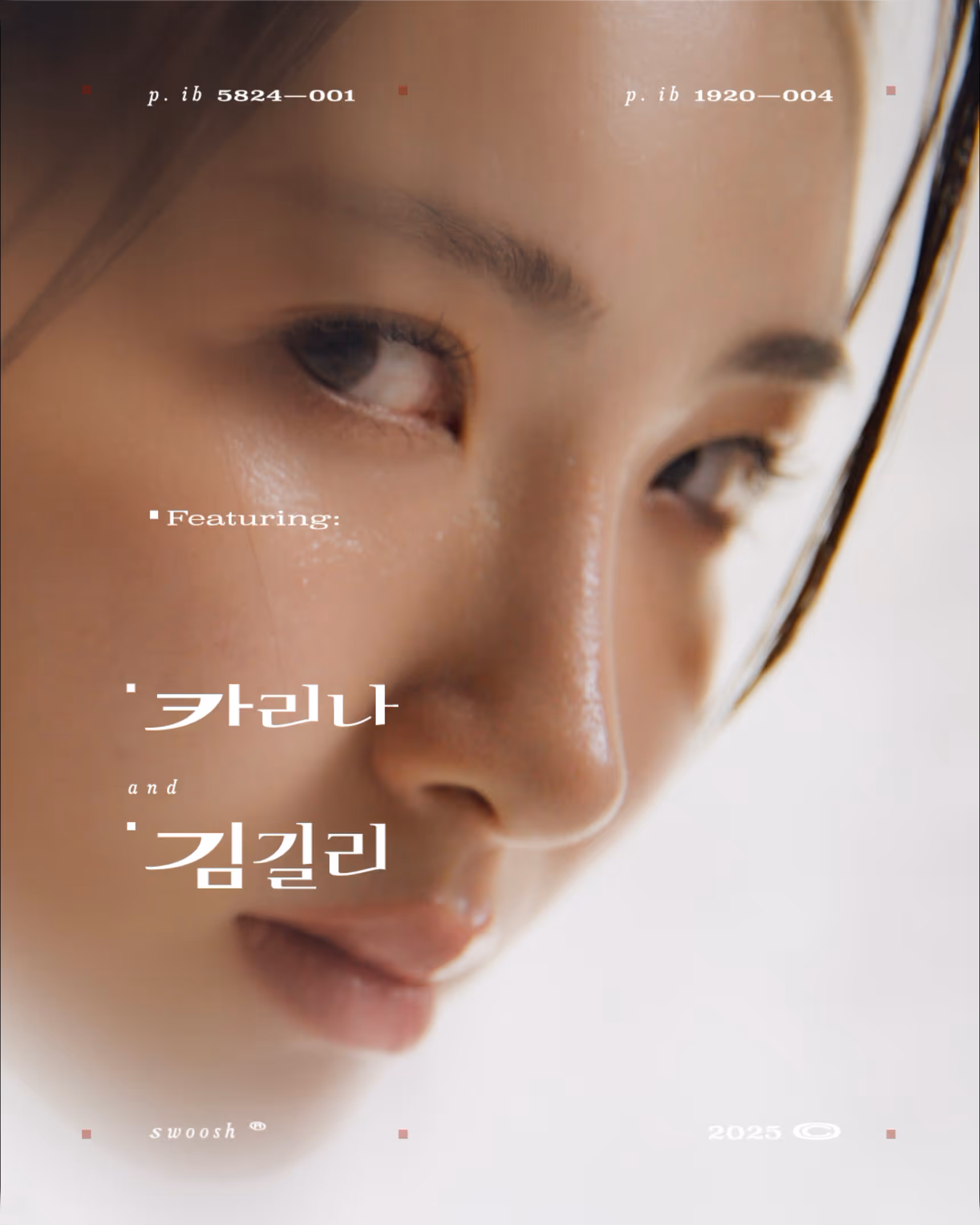
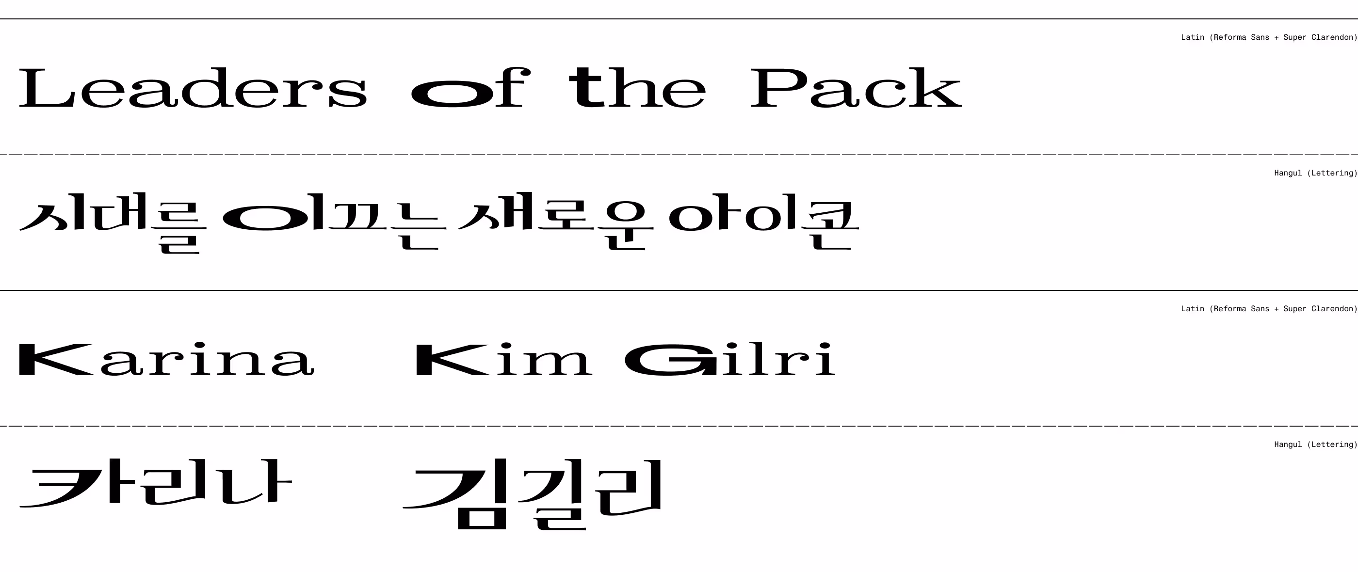
카리나와 김길리가 모델로 참여한 나이키 Air Superbly 및 Air Max Muse의 '시대를 이끄는 새로운 아이콘' 캠페인 메인 헤드카피 국문화 작업입니다. 이번 캠페인은 기존 나이키의 스포티한 무드와 차별화되는 에디토리얼하고 트렌디한 감각을 강조했습니다. 오리지널 영문 타이포그래피는 Reforma Sans와 Super Clarendon 두 서체를 결합하고 극단적으로 장평을 넓힌 비정형적인 락업이 특징이었습니다.
이를 한글로 완벽하게 이식하기 위해 한국의 타입 파운드리 티랩과 협업하여 전용 레터링을 전개했습니다. 네모꼴 실루엣을 가진 한글 특성상 단순히 너비만 늘릴 경우 시각적으로 지루해질 수 있는 한계를 극복하고자, 초성과 중성, 받침의 위치를 리드미컬하게 재배치하여 타이포그래피에 긴장감과 재미를 부여했습니다. 또한 Clarendon 특유의 클래식한 슬랩 세리프 형태를 유지하면서도 획의 디테일을 역동적으로 다듬어, 나이키 고유의 에너제틱한 브랜드 정체성을 잃지 않도록 정교하게 완성했습니다.
This is the Korean localization project for the main headcopy of Nike's Front Runner campaign, featuring models Karina and Kim Gilli for the Air Superbly and Air Max Muse. The campaign emphasized an editorial and trendy sensibility, distinguishing itself from Nike's traditional sporty image. The original English typography featured an atypical lockup that combined Reforma Sans and Super Clarendon typefaces, expanded to extreme widths.
To perfectly transplant this into Korean, we collaborated with the Korean type foundry Tlab to develop exclusive lettering. To overcome the inherent limitation of Hangul's square silhouette—where simply increasing the width can result in a dull visual—we rhythmically rearranged the positions of the initial consonants, vowels, and final consonants, adding tension and flair to the typography. Furthermore, while maintaining the classic slab serif form unique to Clarendon, we dynamically refined the stroke details to ensure that Nike's signature energetic brand identity was preserved with precision.


