


Joy & Freedom
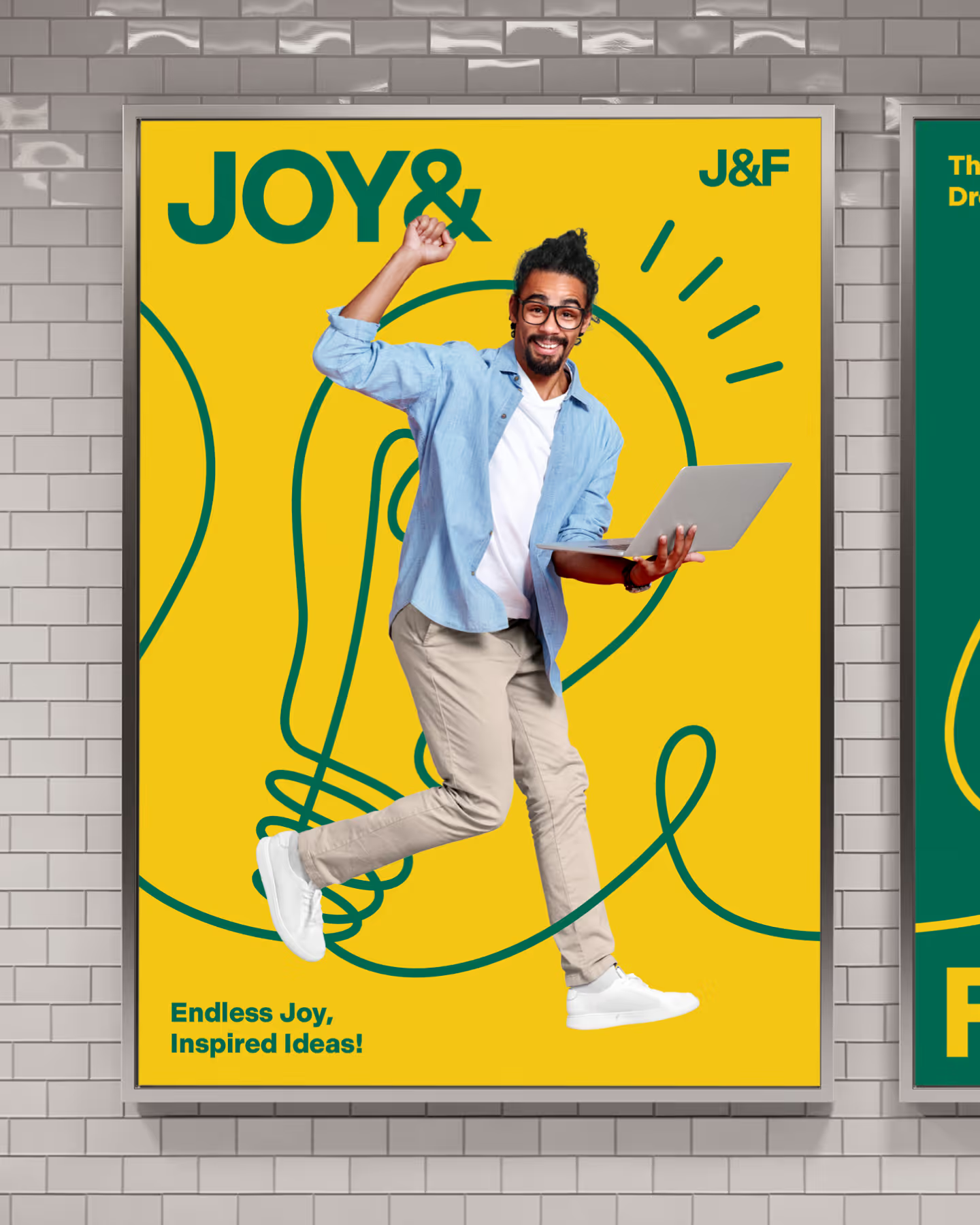
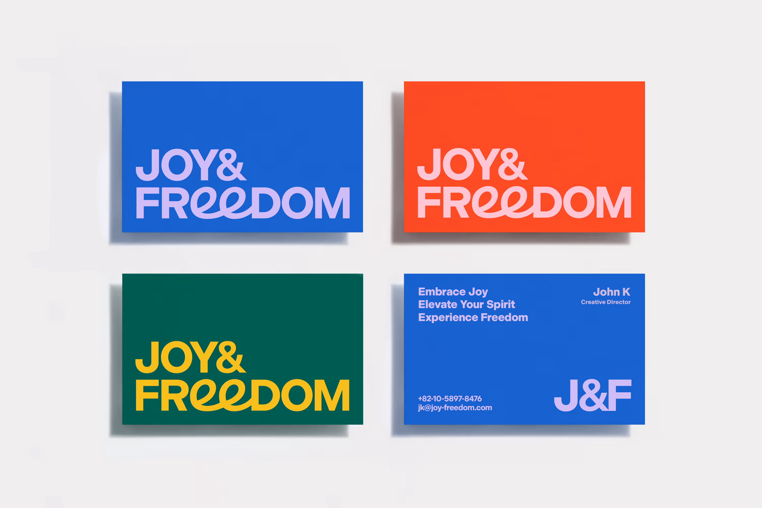
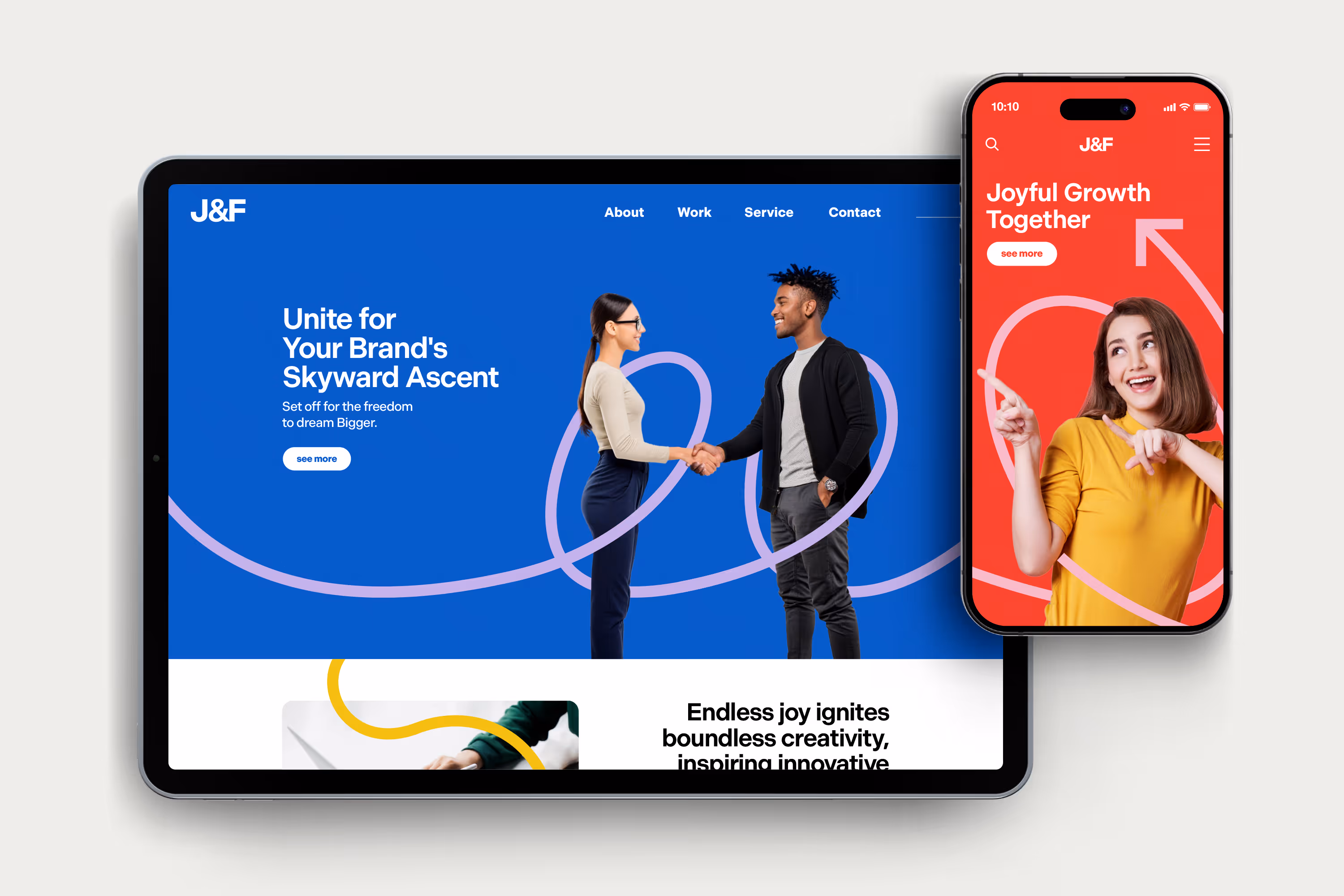
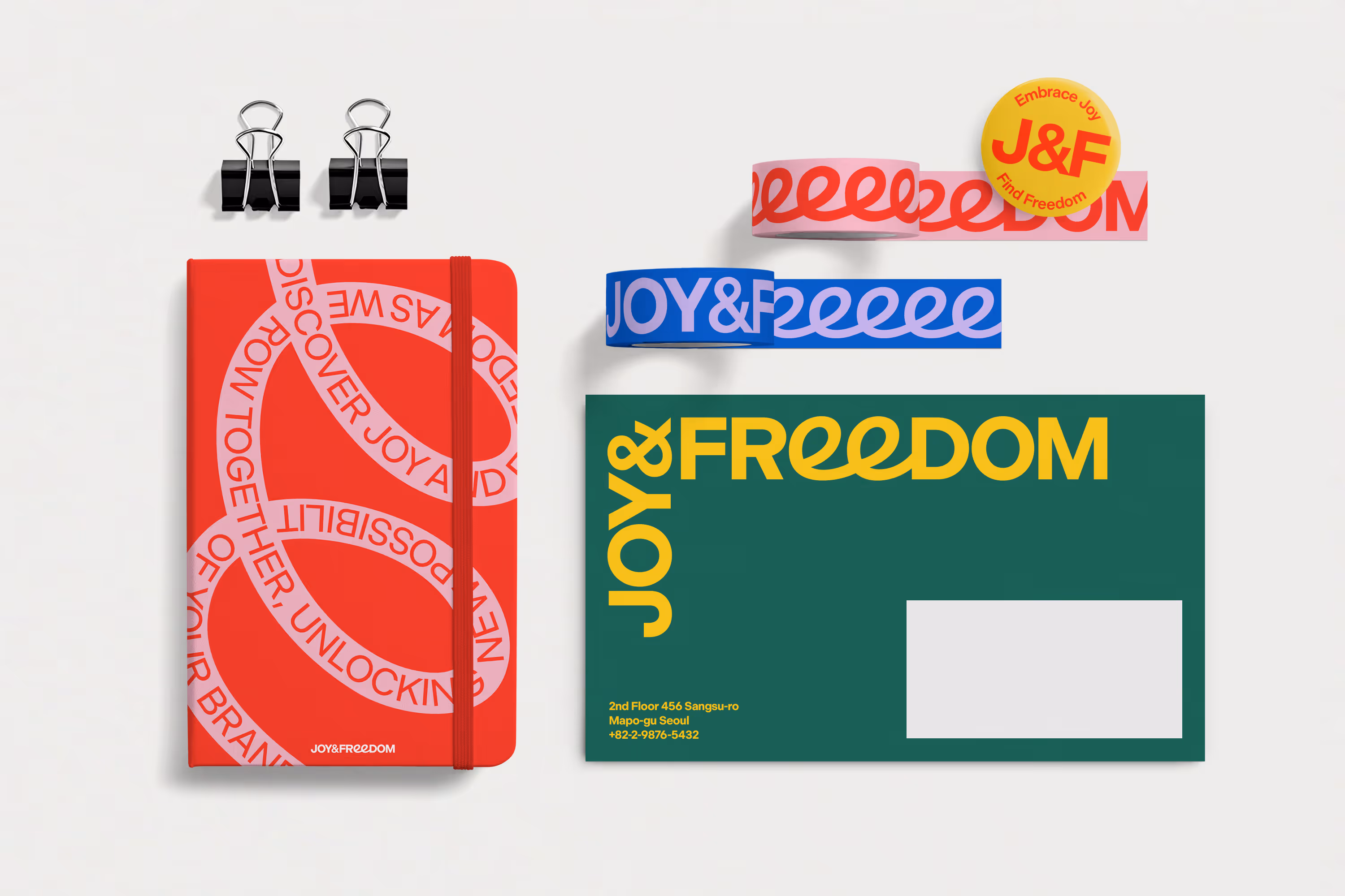
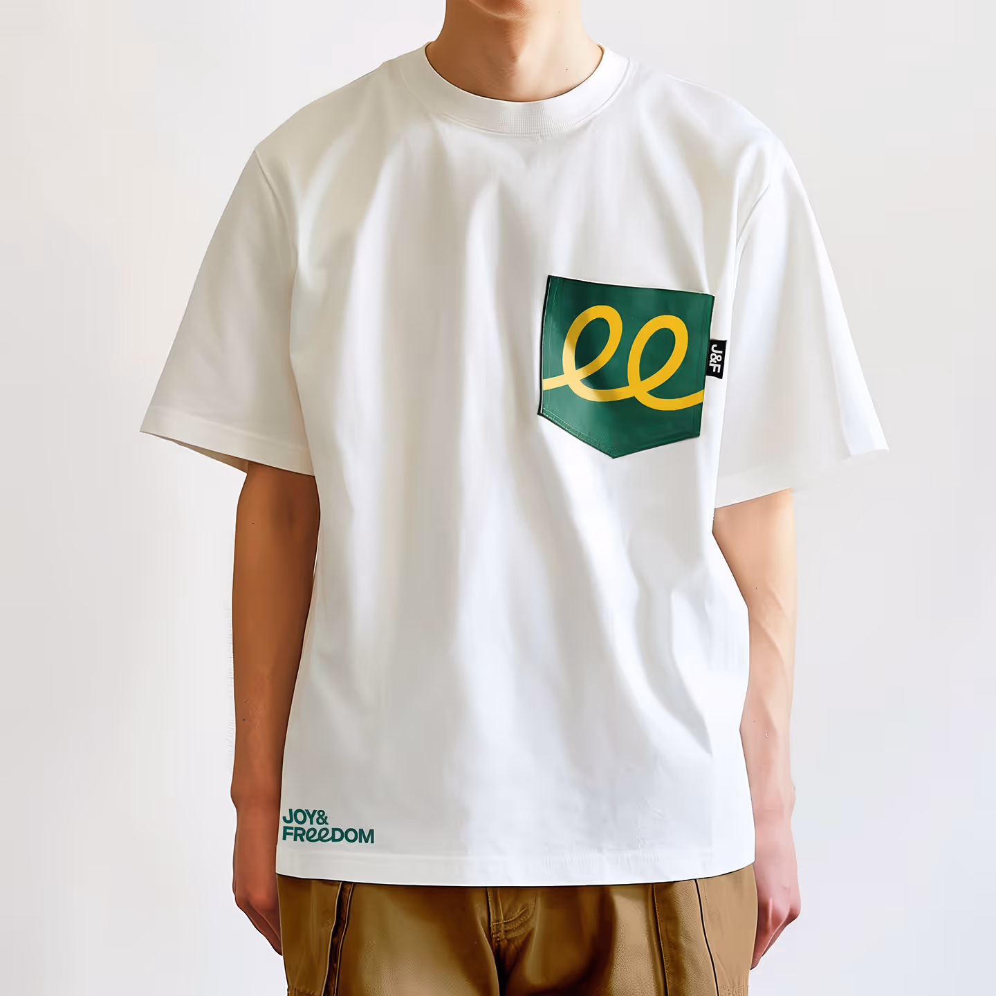
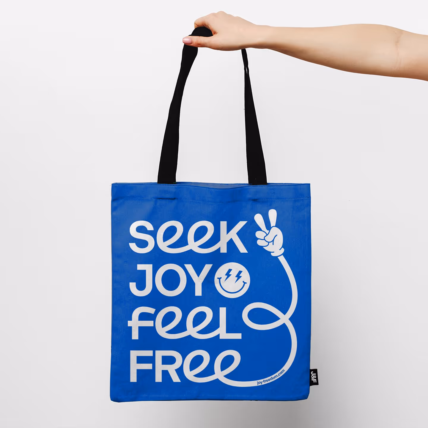
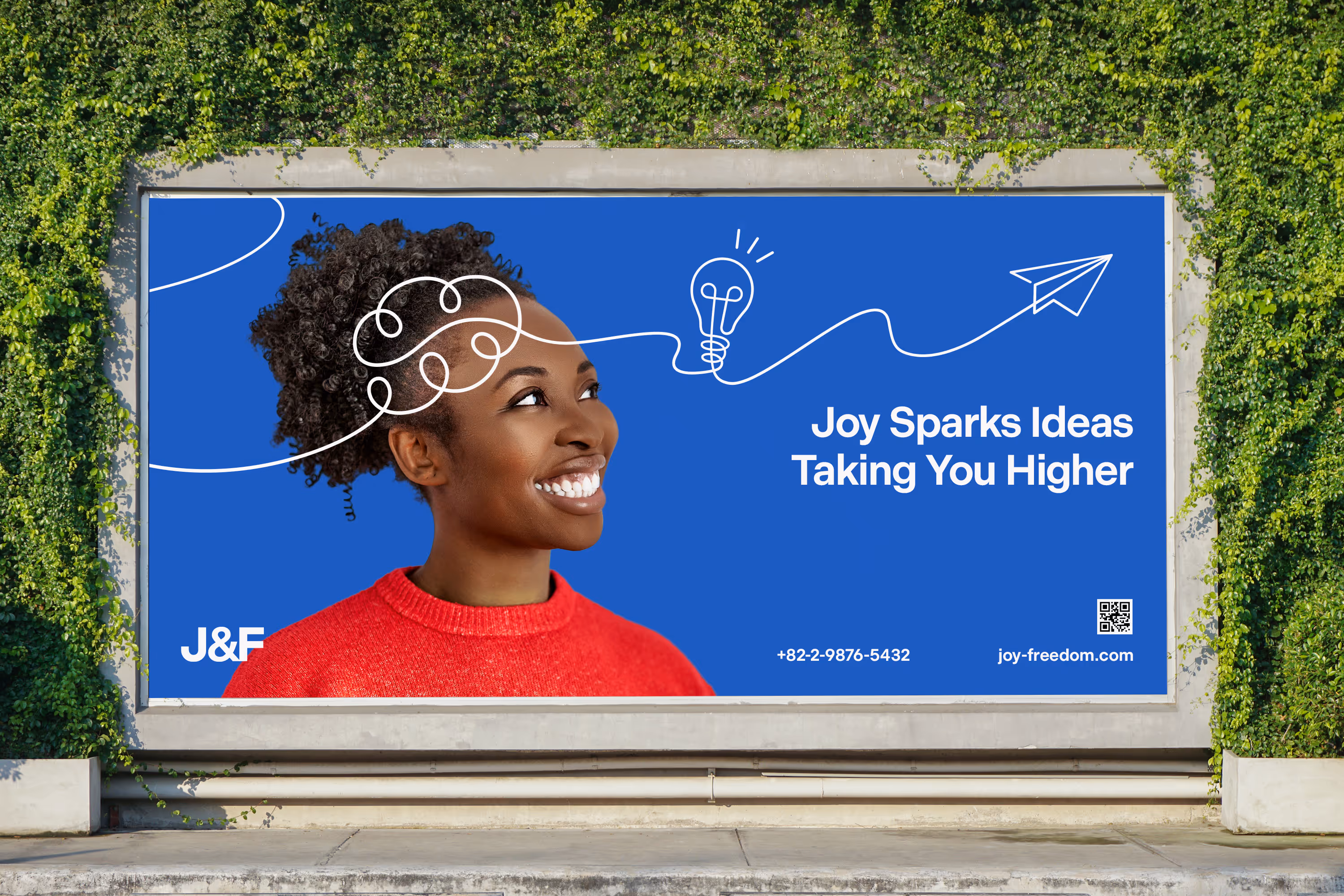
조이앤 프리덤의 CI를 작업하였습니다. 조이앤 프리덤은 고객과 함께하는 즐거운 여정을 통해 더 큰 꿈을 향한 자유를 선사하는 브랜드 컨설팅 기업입니다. 브랜드의 핵심 가치인 '즐거움'과 '자유'를 직관적으로 전달하기 위해, 산세리프 서체를 기반으로 한 로고타입의 'ee' 부분에 경쾌한 곡선의 스크립트 서체를 적용했습니다. 이 곡선 모티프는 다채로운 원색 컬러 팔레트와 어우러져 일러스트레이션, 패턴 등 다양한 그래픽 요소로 유연하게 확장되며, 조이앤 프리덤만의 밝고 긍정적인 에너지를 담은 시각적 아이덴티티를 완성합니다.
We designed the CI for Joy & Freedom. Joy & Freedom is a brand consulting firm that offers the freedom to pursue bigger dreams through a joyful journey with its clients. To intuitively convey the brand's core values of 'joy' and 'freedom,' we applied a lively, curved script typeface to the letters 'ee' within a sans-serif based logotype. Combined with a colorful palette of primary colors, this curve motif flexibly expands into various graphic applications such as illustrations and patterns, completing a visual identity that captures the bright and positive energy unique to Joy & Freedom.


