

Jaiel
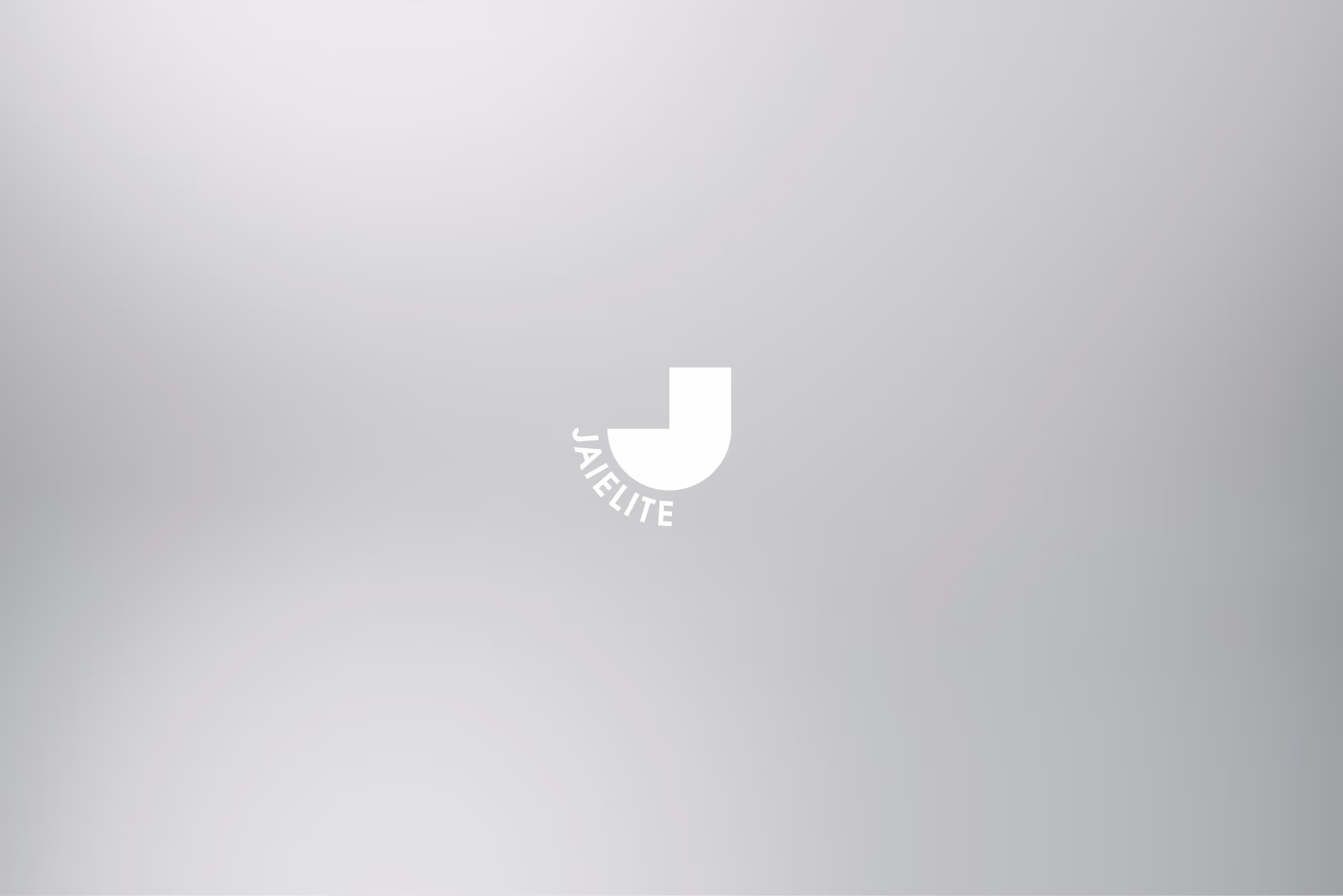
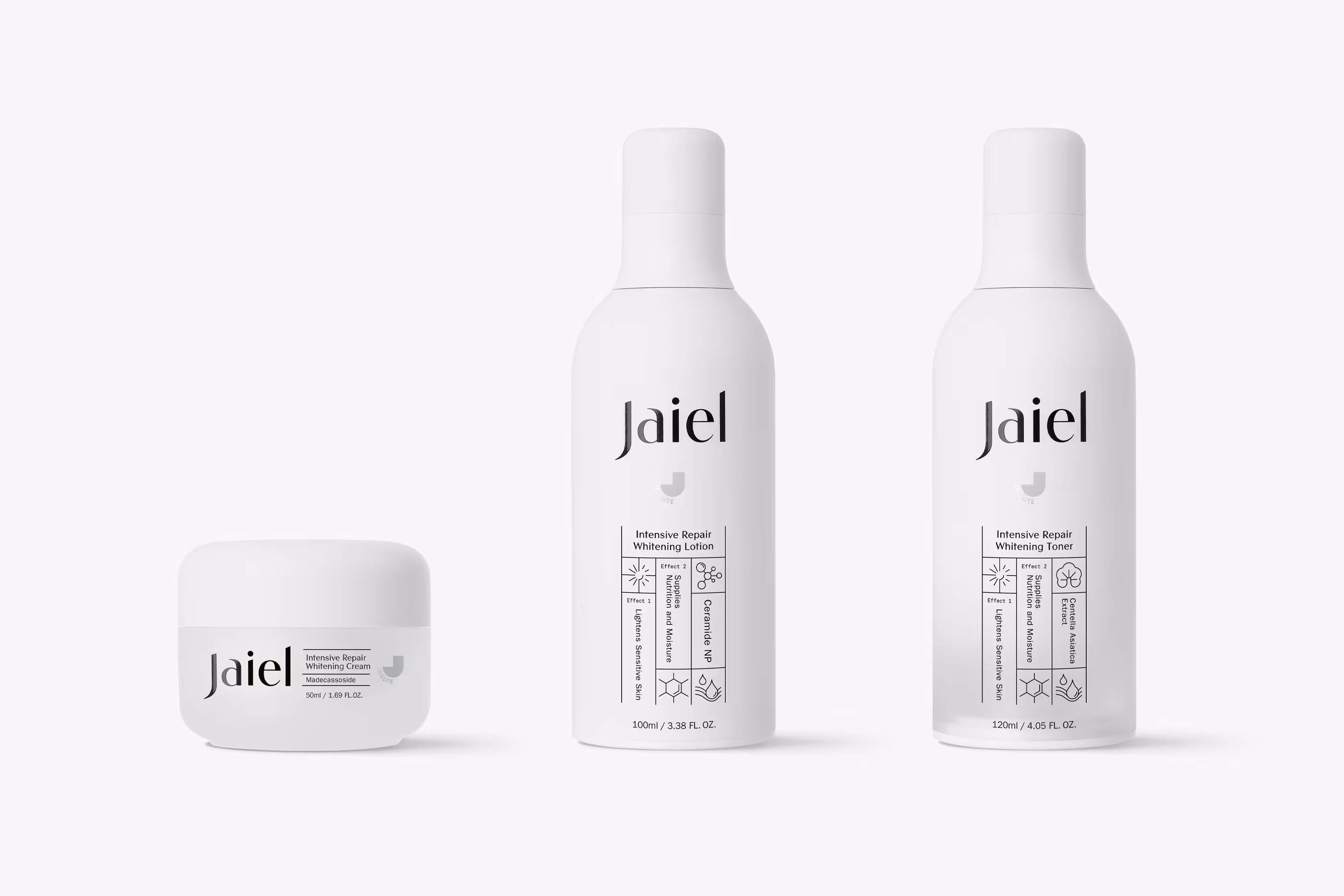
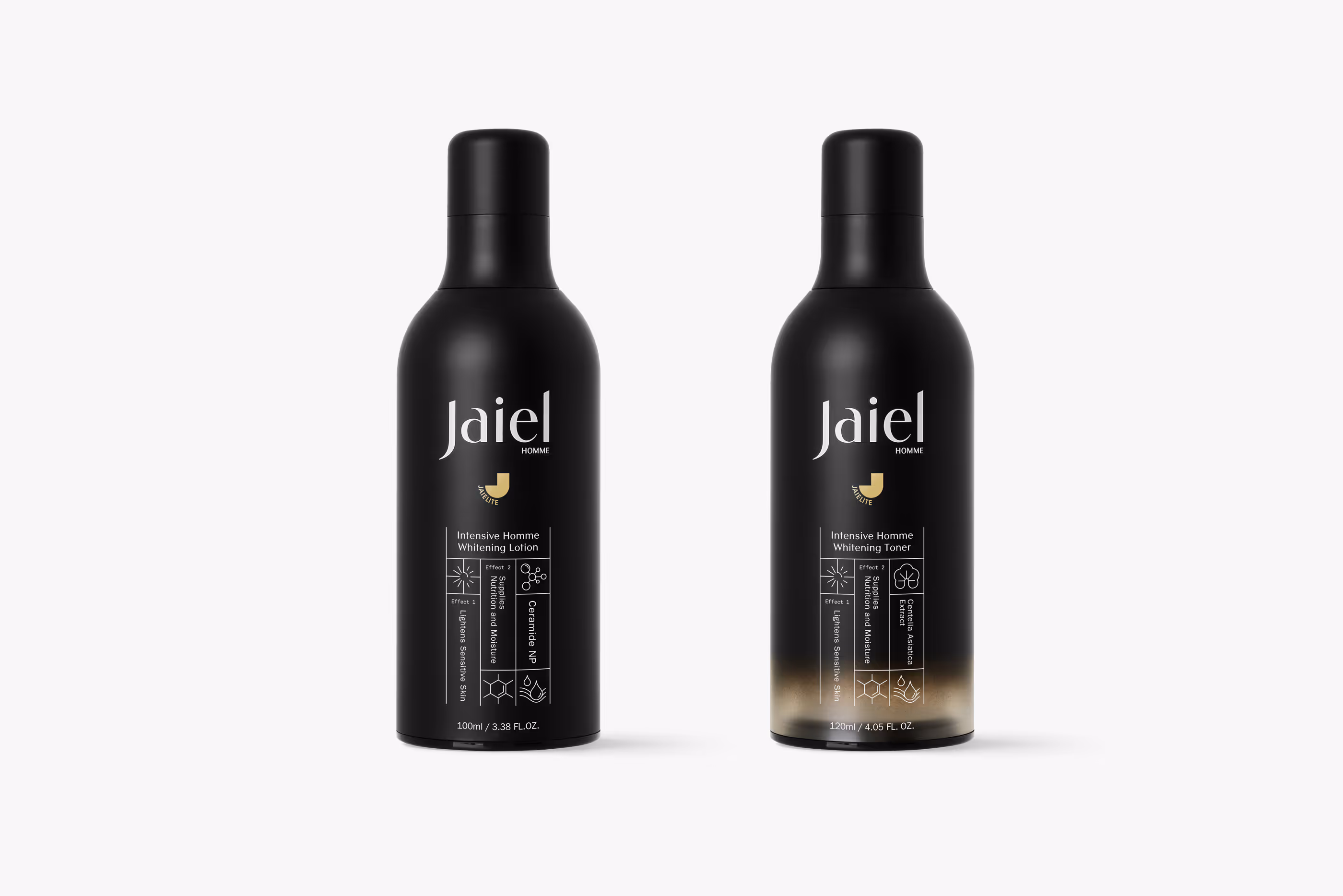
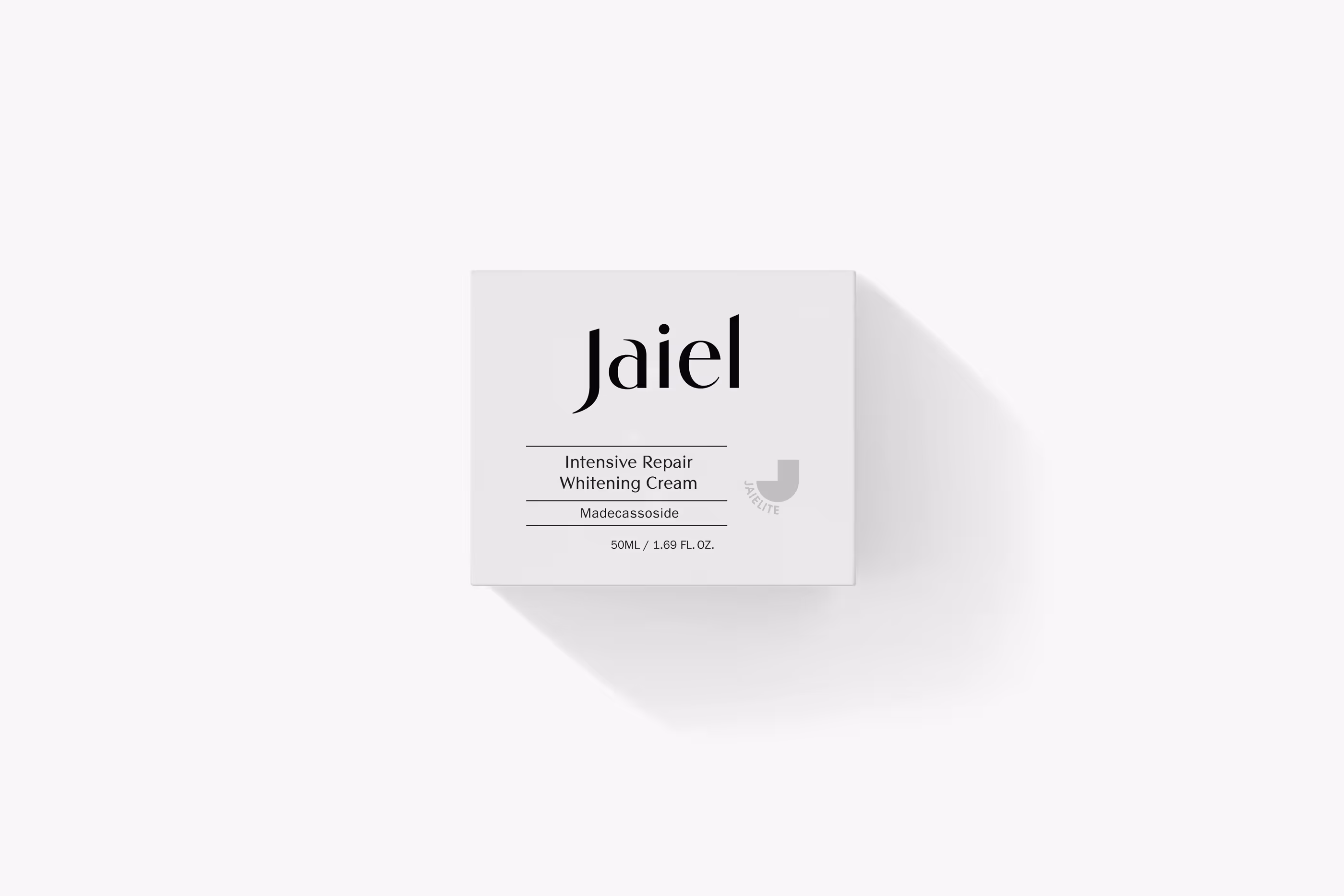
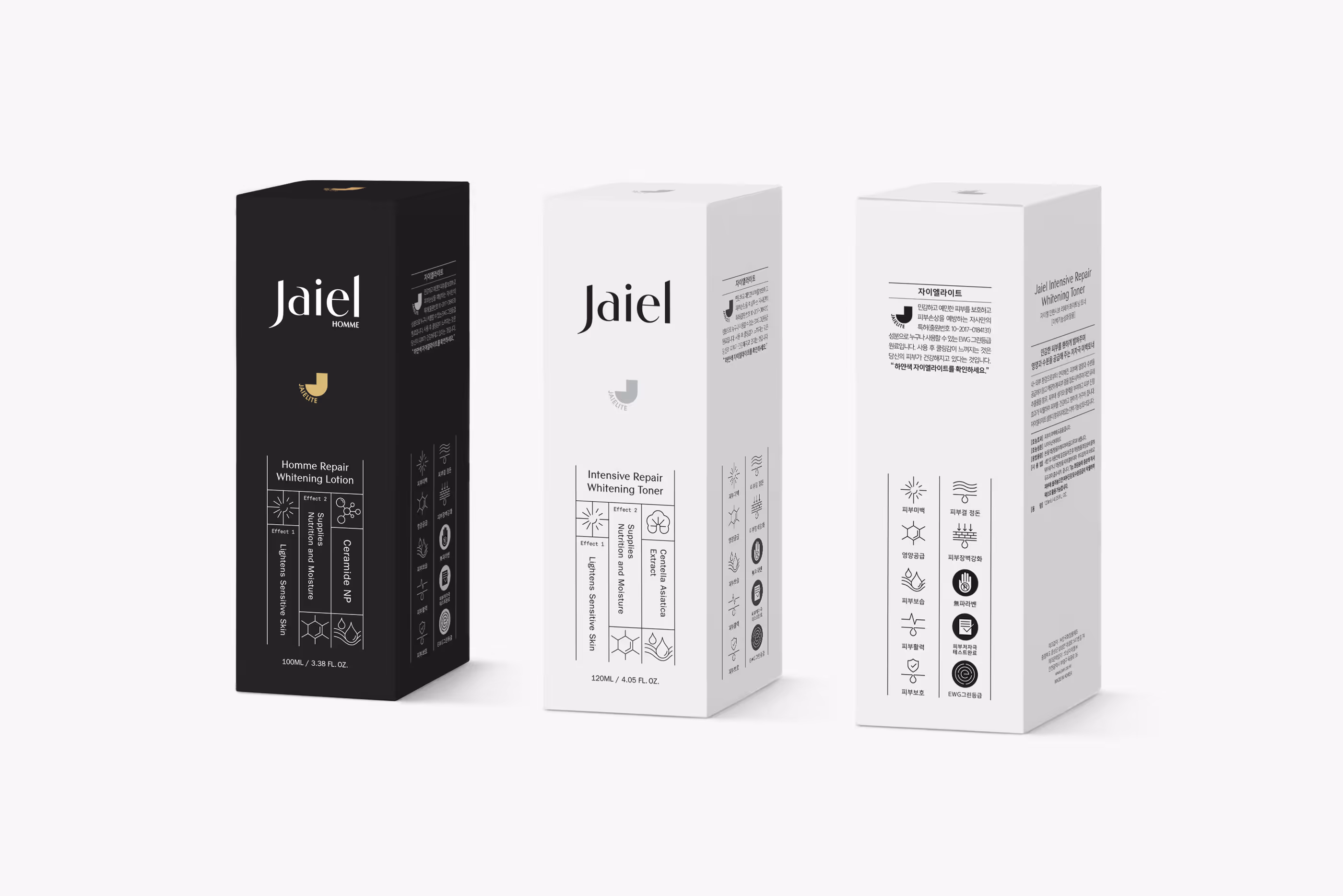
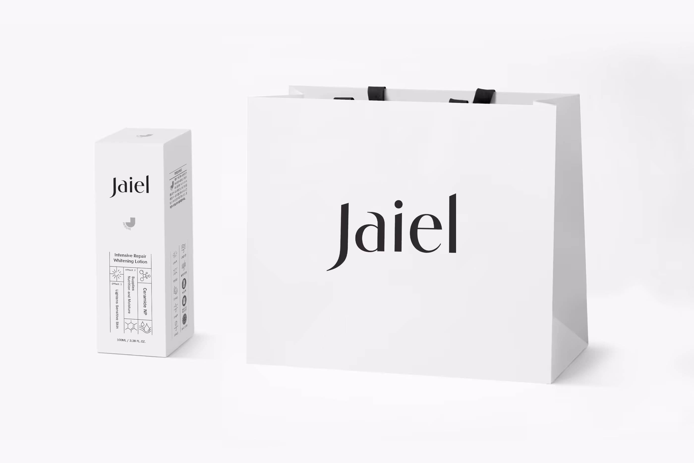
항박테리아 소재인 자이엘라이트를 원료로 한 화장품 브랜드 자이엘의 아이덴티티와 인증마크, 패키지를 디자인했습니다. 날카로운 직선과 볼륨감 있는 곡선의 대비가 돋보이는 서체(Vincenza Display)를 섬세하게 세공한 로고타입으로 첨단 기술과 뷰티의 만남을 연출했습니다. 기하학적 형태의 인증마크를 통해 기술 집약적인 전문성을 시각적으로 강조하는 한편, 제품 용기와 패키 전면에 직관적인 전용 아이콘을 개발 및 적용하여 기능에 대한 소비자의 이해도를 높이고 브랜드 정체성을 견고하게 구축했습니다.
We designed the brand identity, certification mark, and packaging for Jaiel, a cosmetics brand formulated with the antibacterial material Jaielite. The logotype, carefully refined from Vincenza Display—a typeface noted for its striking contrast between sharp straight lines and voluminous curves—beautifully represents the encounter between advanced technology and beauty. We applied a geometric certification mark to visually emphasize a highly technology-intensive and professional image. Additionally, we developed and applied intuitive custom icons on the front of the product containers and packaging, enhancing consumer understanding of the product's functions while establishing a solid brand identity.


